
Contrast to harmonize: Complementary colors
- T.U.B.S International
- Apr 4, 2022
- 1 min read

Updated: Apr 28, 2022

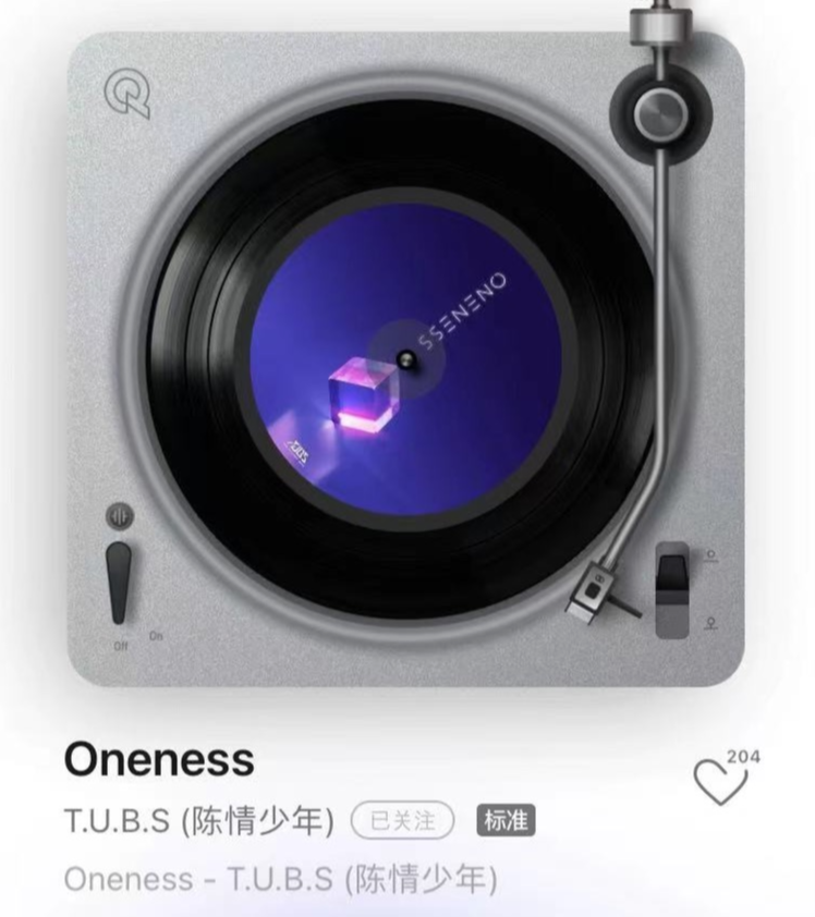
What’s the first impression that come up to your mind when seeing this picture ? If the word ‘beautiful’ popped up when glaring at it then we’re on the same page. But why is it so pleasing to look at ? Or how do we define “beauty” and explain it to someone else ? When talking about arts, the first thing that people think about is ‘color’. Color is the simplest elements of art. As for the theory that we’ll use to describe the beauty of this picture is ‘complementary color’

Complementary colors are the colors that are on the opposite side of the color wheel, for example, red-green, orange-blue, purple-yellow and more. And when these colors are used together, it will create a strong contrast and makes that image ‘pleasant’.

The scientific reasons behind this is because our eyes have different type of photoreceptor cells (cones) . And when 2 opposite colors enter the eyes, they stimulate both low-frequency cones and high-frequency cones at the same time. For the above picture, the complementary color that are used are purple-yellow and greenish blue - redish orange. Now you know why this image is ‘beautiful’, right ? Stay tuned for the next explanation for the next picture 😉 Follow us for more interesting T.U.B.S contents:
Facebook: https://bit.ly/3CA6Q79
Twitter: https://bit.ly/3I3TeCc
Instagram: https://bit.ly/37gnYDr
Youtube: https://bit.ly/3nUTSvj
Website: bit.ly/3A0VaZO


Comments